Master the art of data analytics and dashboard design with step-by-step interactive lessons
0 / 12 topics completed
01
Introduction to Power BI
Power BI is a powerful, unified business intelligence (BI) and data visualization platform developed by Microsoft. It helps organizations connect to disparate data sources, visualize patterns, and share actionable insights through interactive dashboards.
Core Components of the Ecosystem
Power BI Desktop – A free, Windows-native application used to connect to data, model relationships, write DAX, and construct reports.
Power BI Service – A cloud-based SaaS platform (`powerbi.com`) used to share reports, configure workspace collaborations, and schedule data refreshes.
Power BI Mobile – Mobile apps for iOS, Android, and Windows devices to view dashboards on the go.
The standard analytics workflow follows a natural data progression:
Phase
Tool Location
Description
1. Extract (Import)
Power BI Desktop
Connect to files, databases, or API feeds
2. Transform (Clean)
Power Query Editor
Shape columns, merge tables, set data types
3. Model
Model View
Define relationships, write DAX columns and measures
4. Visualize
Report View
Create charts, tables, KPIs, and maps
5. Publish & Share
Power BI Service
Upload to cloud workspaces and share report URLs
Practice: Understanding BI Components
Which component of the Power BI ecosystem is primarily used to perform data ingestion, cleaning, and model development?
Answer: Power BI Desktop
Explanation: While the cloud-based Power BI Service allows for minor edits and sharing, all core data preparation, transformation (Power Query), table modeling, and expression writing (DAX) are executed in the desktop tool.
02
Power BI Installation & Setup
To build reports, you must install **Power BI Desktop**. It is free and updated monthly by Microsoft.
System Requirements & Installation Steps
Operating System: Native installation is supported only on Windows (Windows 10/11 or Windows Server equivalents).
Mac/Linux Users: Must run a Windows Virtual Machine (e.g., Parallels, VirtualBox) or use cloud-based Remote Desktop environments.
Installation Method 1 (Recommended): Open the Microsoft Store on Windows, search for "Power BI Desktop", and click install. This manages automatic monthly updates in the background.
Installation Method 2: Download the standalone `.msi` installer executable from the official Microsoft download center.
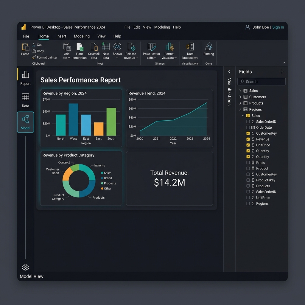
Upon opening Power BI Desktop, you are greeted with the main landing interface consisting of three primary views accessible on the left-side panel:
Figure 2.1: The main workspace interface of Power BI Desktop including the canvas, filters pane, and data panel.
Report View: The visual layout canvas where you drag-and-drop charts, format text, and place slicers.
Data View: A spreadsheet grid layout allowing you to inspect, sort, filter, and review raw loaded data rows.
Model View: A graphical schematic layout showing table boxes and active relationship lines connecting key columns.
Practice: Installation OS Compatibility
True or False: A developer running macOS can install Power BI Desktop directly without any virtual machine or emulation layer.
Answer: False
Explanation: Power BI Desktop is strictly a Windows-native application. Mac developers must utilize emulation tools (like Boot Camp or Parallels) or a cloud-hosted Windows environment to run Power BI Desktop.
03
Data Sources and Data Import
Power BI can load data from hundreds of different sources. You initiate data retrieval by clicking the Get Data button on the Home ribbon.
Common Connectors
Flat Files: Excel Workbooks (`.xlsx`), CSV text files (`.csv`), XML, and JSON feeds.
Relational Databases: Microsoft SQL Server, PostgreSQL, MySQL, Oracle, and Access.
Online Services: SharePoint Folders, Salesforce, Google Analytics, and Dynamics 365.
Web/APIs: Scraping tabular data directly from a public URL or calling JSON REST API endpoints.
When connecting to enterprise data sources, you must choose between three distinct storage modes:
Storage Mode Comparison
Import Mode (Default): Data is loaded and compressed directly into Power BI's in-memory cache. Highly performant but file sizes are capped (1GB in free tier), and data must be refreshed.
DirectQuery: Power BI holds no local data. Instead, it queries the database in real-time as users interact with visuals. Ideal for massive datasets or real-time updates, but slower performance.
Live Connection: Connects to a pre-defined semantic model in Analysis Services or the Power BI Service.
Practice: In-Memory Storage Modes
Which storage mode provides the fastest visual rendering speed by caching tables directly in the local system RAM?
Answer: Import Mode
Explanation: Import Mode uses the VertiPaq database engine to compress and store data in-memory, resulting in extremely fast analytical aggregations compared to DirectQuery which sends SQL statements on every click.
04
Power Query Basics
Once you select a data source, click **Transform Data** to open the **Power Query Editor**. This is a dedicated data-preparation window.
The Power Query Interface
Query Ribbon: The toolbar filled with common data-shaping shortcuts (split columns, change types, pivot).
Queries Pane: The left sidebar listing all imported tables (queries).
Data Preview Area: The center grid showcasing a sample preview of rows.
Applied Steps: The right sidebar tracking every transformation step sequentially.
Every button click in Power Query writes code in Microsoft's proprietary functional language: M Formula Language (or simply M). Power Query records these steps so they can be re-run whenever new data is loaded.
M Language Query
let
Source = Csv.Document(File.Contents("C:\data\sales.csv"), [Delimiter=","]),
PromotedHeaders = Table.PromoteHeaders(Source),
ChangedType = Table.TransformColumnTypes(PromotedHeaders, {{"SalesAmount", typenumber}})
in
ChangedType
Practice: Under the Hood of Power Query
What scripting language is written in the background as you click buttons in the Power Query Editor?
Answer: M Formula Language (often shortened to "M")
Explanation: M is a functional, case-sensitive language designed specifically for data mashup and extraction. The query steps recorded in the "Applied Steps" pane are just GUI representations of M code blocks.
05
Data Transformation and Cleaning
Real-world datasets are rarely ready for report building. Power Query offers diverse operations to scrub, structure, and clean tables.
Core Data Cleaning Transformations
Setting Correct Data Types: Cast columns explicitly (e.g., convert numeric codes to strings, ensure dates are recognized as Calendar formats).
Promote Headers: Set the first row of data as the actual column headers.
Remove Duplicates & Nulls: Clean keys and empty cells to ensure database integrity.
Split Column: Split strings (e.g., splitting "LastName, FirstName" by the comma delimiter).
Unpivot Columns: Convert wide data tables (e.g., columns for Jan, Feb, Mar) into narrow data tables (a single "Month" column and an "Amount" column).
Below is a visual example of pivoting vs unpivoting datasets for clean ingestion:
Format Type
Structure
Best Practice Recommendation
Wide (Pivoted)
Product | JanSales | FebSales | MarSales
Bad. Difficult to filter and aggregates poorly in charts.
Narrow (Unpivoted)
Product | Month | SalesAmount
Excellent. Ideal structure for relational databases.
Practice: Unpivoting Use Case
If you import a financial table that has 12 columns for monthly budget figures (Jan-Dec), which Power Query operation should you apply to consolidate these into a single "Month" column and a single "BudgetAmount" column?
Answer: Unpivot Columns (or Unpivot Other Columns)
Explanation: Unpivoting rotates the columns into attribute-value pairs, converting your wide dataset into a clean vertical table, which is the preferred format for analytical modeling.
06
Data Modeling Basics
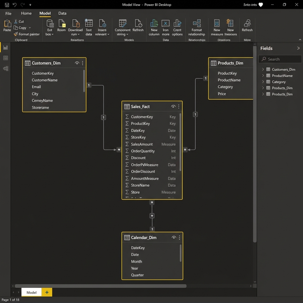
Once tables are cleaned and loaded, you enter the **Data Modeling** phase in Power BI. A well-designed model is critical for accurate calculations and fast reports.
The Star Schema Concept
The industry-standard approach for Power BI models is the Star Schema. In a Star Schema, tables are separated into two distinct roles:
Fact Tables: Contain quantitative observational business measurements (e.g., `SalesAmount`, `TransactionQty`, `DiscountPrice`) along with foreign keys connecting to dimensions. Usually long and narrow.
Dimension Tables: Contain descriptive text details about business entities (e.g., product names, customer addresses, calendar dates). Usually wide and short.
Organizing data in a Star Schema minimizes data redundancy and maximizes cross-filtering speed, preventing formula errors.
Figure 6.1: Star Schema structure where descriptive dimension tables circle a central transaction fact table.
Practice: Fact vs Dimension
Classify the following tables as either a Fact table or a Dimension table: (1) `ProductList` (containing names, weights, and categories), (2) `InternetSalesTransactions` (containing timestamps, order numbers, and quantities sold).
Answer: (1) `ProductList` is a Dimension table; (2) `InternetSalesTransactions` is a Fact table.
Explanation: `ProductList` contains descriptive context metadata about products, whereas `InternetSalesTransactions` stores quantitative records of events that occur continuously over time.
07
Relationships and Cardinality
Tables are connected in the **Model View** by dragging matching key columns (e.g., `ProductID` in the Fact table to `ProductID` in the Product Dimension).
Relationship Properties
Cardinality:
One-to-Many (1:*) (Standard): One row in the dimension table relates to many rows in the fact table (e.g., one customer makes many purchases).
One-to-One (1:1): Columns match row-for-row; usually indicates the tables should be merged.
Many-to-Many (*:*): Extremely complex; should generally be avoided using bridge tables.
Cross Filter Direction:
Single (Recommended): Filtering flows from the "one" side (Dimension) to the "many" side (Fact).
Both: Filters flow in both directions. While convenient, it can lead to performance issues and ambiguity in calculations.
💡
Always build relationships with a Single cross filter direction pointing from Dimension tables to Fact tables. This ensures query results remain logical and predictable.
Practice: Relationship Flows
You have a `Customers` table (with unique customer keys) and an `Orders` table. How should the cardinality and cross filter direction be configured for optimal design?
Answer: Cardinality: One-to-Many (1:*) from `Customers` (1) to `Orders` (*); Cross Filter Direction: Single.
Explanation: A single customer can place multiple orders, and filtering customer attributes (like City) should filter the orders table, not vice versa.
08
DAX (Data Analysis Expressions) Fundamentals
**DAX** is a formula language used to create custom calculations in Power BI. DAX formulas look similar to Excel formulas but operate on tables and columns rather than individual cell addresses.
Calculated Columns vs Measures
Calculated Column: Evaluated row-by-row during data load. Takes up storage space. Used for slices or rows.
Measure: Evaluated dynamically in real-time as users click on visuals (uses Filter Context). Takes no storage space. Used for totals and metrics.
Here are three essential DAX functions commonly used in reports:
DAX Measure Calculations
// Sum of a column
Total Revenue = SUM(Sales[SalesAmount])

// Safe division avoiding divide-by-zero errors
Profit Margin = DIVIDE([Total Profit], [Total Revenue], 0)

// CALCULATE overrides the current filter context
USA Revenue = CALCULATE([Total Revenue], Customers[Country] = "United States")
Practice: Writing DAX
Write a DAX measure named `AverageUnitCost` that calculates the average of the `UnitCost` column in the `Products` table, utilizing safe division to handle empty states.
DAX
AverageUnitCost = AVERAGE(Products[UnitCost])
Or alternatively, to calculate this row-by-row or to divide aggregate totals:
Best practices in formatting visualizations include limiting the number of visual elements per page to avoid clutter, using clear descriptive titles, and selecting a simple, high-contrast color palette.
Practice: Selecting Visuals
Which visualization type is most effective for displaying a single numerical summary value like "Total Customer Count"?
Answer: Card Visual (or KPI Card)
Explanation: Card visuals display a single big number, making them ideal for high-level summary KPIs that users need to digest instantly at the top of the dashboard page.
10
Filters, Slicers, and Drill-Down
Reports must be interactive. Power BI supports several built-in features to let users filter and drill into metrics.
Filtering Mechanisms
Slicers: Visual controls on the report canvas (checkboxes, dropdowns, date sliders) that let users filter charts in real-time.
Filter Pane: Collapsible right-hand panel where developers configure filters scoped at different levels:
Visual-level: Applies to only one chart.
Page-level: Applies to all charts on the active page.
Report-level: Filters all pages across the entire `.pbix` file.
Drill-Down: When a chart uses a hierarchical field structure (e.g., Category -> Subcategory -> Product), clicking the down-arrow button enables users to navigate from high-level totals down to granular details.
Practice: Filter Scopes
If you want to filter out a defunct store branch across all 5 pages of your report, which filter scope should you apply in the Filter Pane?
Answer: Filter on all pages (Report-level filter)
Explanation: Placing the store branch filter under the "Filter on all pages" section ensures that it is applied uniformly across the entire report file without needing to configure it manually on every page.
11
Dashboard and Report Creation
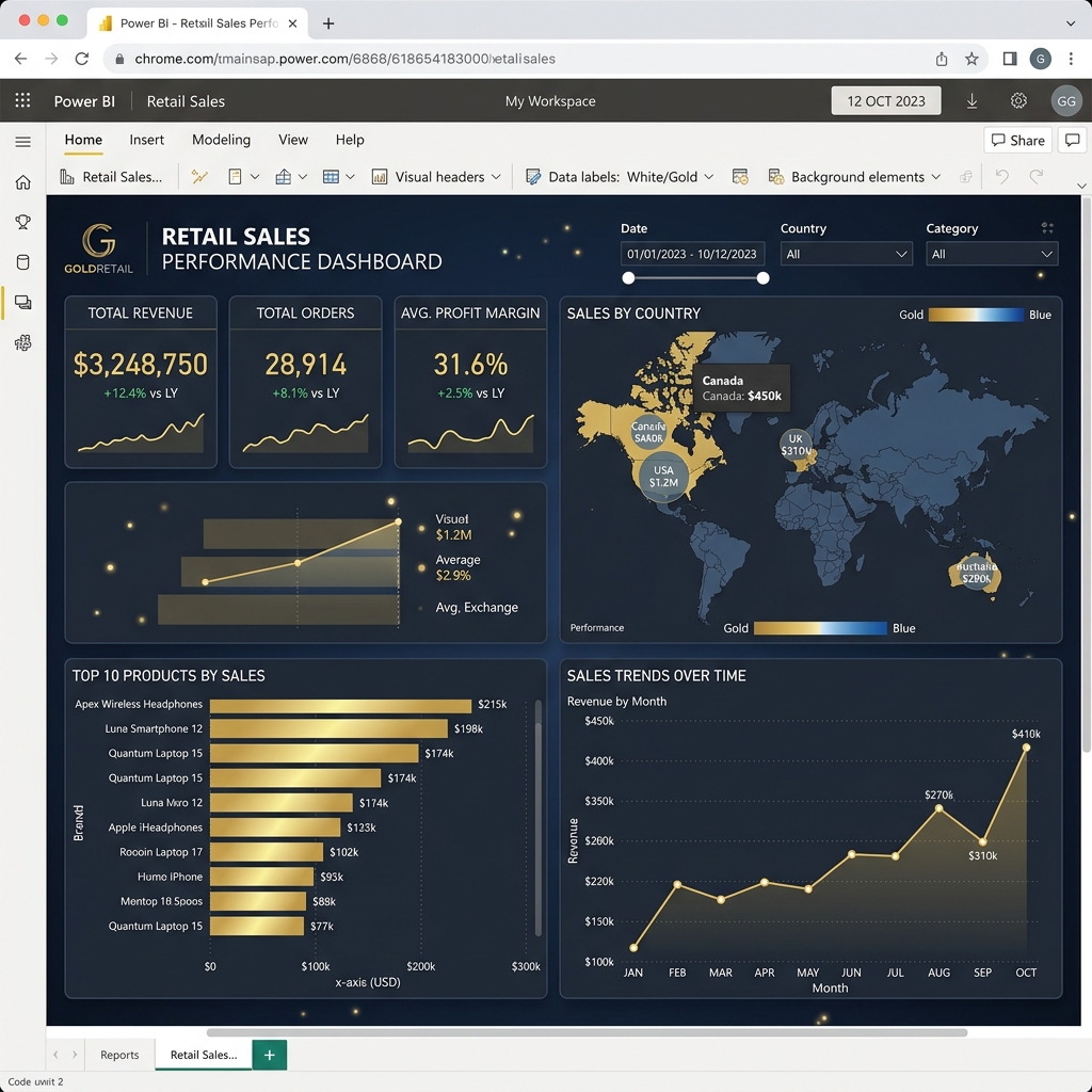
A high-quality dashboard must guide the viewer's eye and tell a clear story.
Design Principles
Grid Layout: Align elements to invisible grid lines to keep the report structure looking clean and professional.
Visual Hierarchy: Place key figures (KPI Cards) at the top left, aggregate trend charts in the center, and raw matrix lists at the bottom.
Color Consistency: Use colors to highlight key data points rather than decorating the page. Match colors to company branding.
Figure 11.1: A structured retail sales dashboard showing performance metrics, line trend charts, and geographic coordinates.
Practice: Design Rules
According to reading hierarchy guidelines, where is the best position on the report page to display high-level KPI cards?
Answer: The top-left corner / top row of the page.
Explanation: In Western culture, users read from top-left to bottom-right. Positioning core KPI numbers at the top ensure they are the first metrics seen when a user opens the report.
12
Publishing and Sharing Reports
To share your report, you must publish it from Power BI Desktop to the cloud-based **Power BI Service**.
Publishing Steps
Save your report locally as a `.pbix` file.
Click the Publish button in the home ribbon of Power BI Desktop.
Select a target cloud workspace (e.g., "My Workspace" or an enterprise collaboration workspace).
Open the published URL in a web browser.
Once published, you can share access, embed the interactive report on a SharePoint site or Teams channel, or export snapshots as a PDF file.
⚠️
Sharing reports securely within an organization typically requires users to hold a paid Power BI Pro or Premium Per User (PPU) license, unless the workspace is hosted on dedicated Power BI Premium capacity.
Practice: License Sharing Requirements
True or False: Any user with a free Power BI account can view a report shared securely by another user, even if the report is not hosted on Premium capacity.
Answer: False
Explanation: Secure sharing in standard workspaces requires both the publisher and the viewer to hold a Pro or PPU license. Free users can only view reports if they are published to public webs (unsecure) or hosted on Premium capacity nodes.